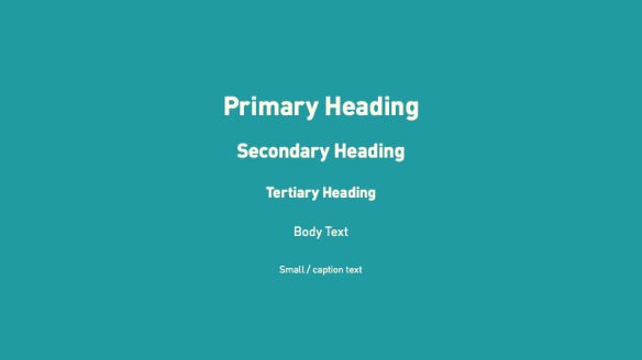
Typographic Hierarchy
Designers have to know (what, when, where, why) the writing will be read to make it legible. For example to legibility of writing typographic hierarchy can be used.
Paragraph spacing:
To line up the paragraph spacing, the body become equal to text. Because of that the size of character should equal to paragraph spacing.
Also the other features for legibality are:
-
The line spacing should be more than the space of between words.
-
Too much space between the lines reduce the blemish and contrast of the text.
-
Visual element which close the text complicate the perception both the text and visual effects.
-
The consended texts cause the unite of character and the extended texts cause to hold over the time of reading.

